 |
| "High Hopes," 14 x 11 oil on linen. |
The reference for this painting has been on the back burner for a long time – literally eight years. The moment I saw the photo on my camera, I knew it was special. I knew I needed to paint it. It just took me a while to decide it was time!
 |
| "Firstborn," 14 x 11 oil on linen. |
This is the most complex pallete I use – it's one I adopted from a workshop with Val Hinz ten years ago, and it's really the only time I methodically lay out the paint before I start!
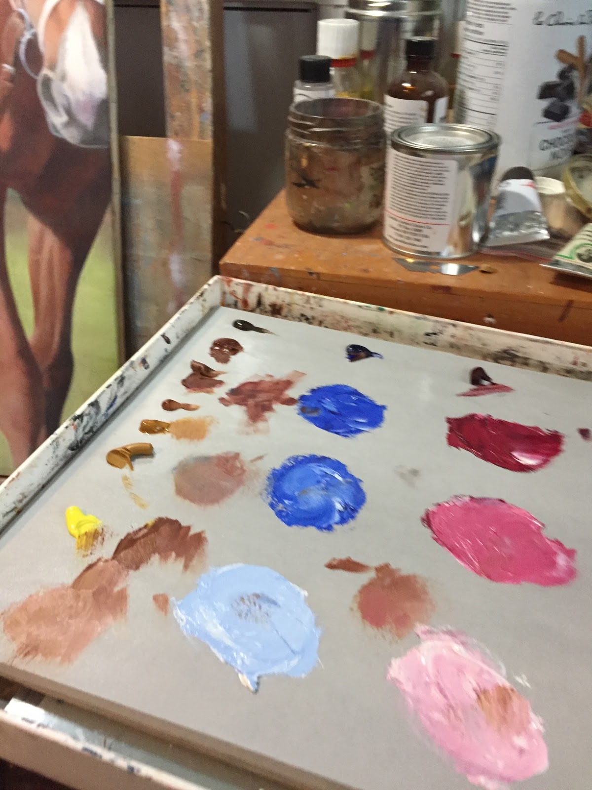
In it's most basic sense, it's red, blue, and yellow. Normally I'll use Alizarin Crimson and Ultramarine Blue...then Val's palette involved a series of yellows, from dark to light. Most often I use Burnt Umber, Brown Ochre, Yellow Ochre and Cadmium Yellow Light. The red and the blue are lightened with Titanium white, and added to the appropriate yellow of the same hue.
With this painting, you can see I started with my usual underpainting, then built up the colour. The usual story! I just happen to have a little time-lapse painting of part of that!
FYI...I could have sold this painting twice. Some pieces are like that! "Firstborn" was also one of those!
I hope you enjoyed my little series on painting chestnuts!
1 comment:
I need to post to this blog more! Is anyone reading it, though?
Anyone?
Post a Comment